

SIFF website featured on array of digital platforms
SIFF
Branding & Identity ~ Illustrator, Photoshop, InDesign, After Effects
In full collaboration with Hannah Pearlman
How might we refresh SIFF’s brand to better communicate its readiness to elevate the diverse array of voices in Seattle?
Task
Solution
Our brand refresh uses color and shape to mimic light and characterize SIFF as a window into the world of film. This rebrand is about bringing stories into focus.
This project was done as an assignment for SCCA and does not have any affiliation with SIFF. Our class was assigned to rebrand existing organizations so that we could research their missions and established practices in order to accurately learn the branding process. This project should be seen as hypothetical, as if SIFF was looking to rebrand.
A Point of Note

Logo

Logo In-Situ
About SIFF
Seattle International Film Festival (SIFF) was founded in 1976 and consists of three acts: the Festival, Year-Round Cinema, and Education. SIFF attracts a diverse crowd of Seattle film enthusiasts, as well as filmmakers, students, and distributors from around the globe.
LOGO
The logo plays with the visual vernacular of cinema, taking inspiration from the modern widescreen shape and the historic zoetrope, while also nodding to the experience of sitting in a dark cinema. Whatever image it sits atop, it represents a window into a story.
Process
This project began with extensive research to understand how SIFF views themselves as an organization, their connection to the film industry, and their relationship to Seattle communities.
Through a series of brand discovery exercises, we determined SIFF’s strongest brand attributes to be about entertainment, enrichment, education, and connection.
This placed SIFF as a film experience curator. From our brand exploration, we condensed SIFF’s brand character into three guiding words: off-beat, dynamic, and converging.
Off-beat | Dynamic | Converging
Concept Board

Approach & Assets
All assets were created using a technicolor color palette on a black background. We used gradients and striations to allude to screens, lenses, and illusions of motion. Many of these elements are conceptually abstract, meant to capture a character or story, or the space for one to appear.

Print Advertisement

Print & Mobile Tickets for Regular and Festival Showings

Festival Posters


Festival Posters In Situ

Digital (Web Banner) Advertisement

Email Newsletter

Merchandise: Tote Bag

Merchandise: T-Shirt

Merchandise: Enamel Pins

Member Card
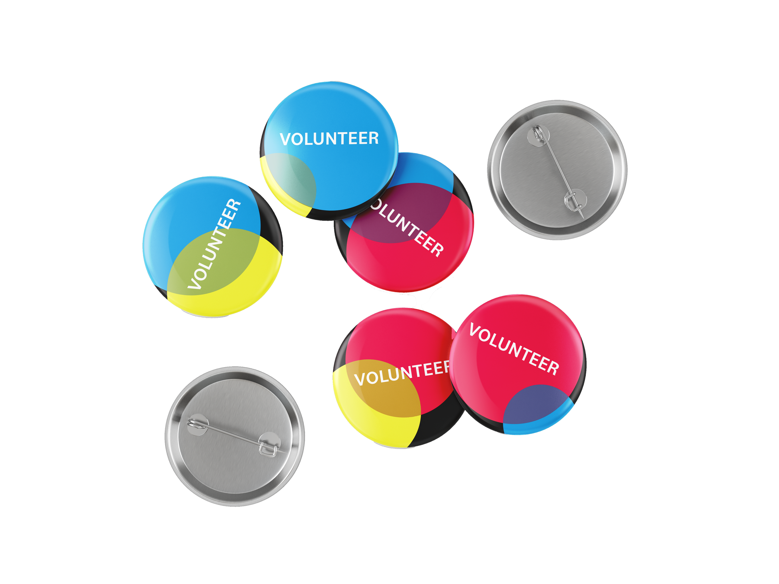
Volunteer Buttons

Staff Lanyard

Style Guide (aka the Brand Book) where brand guidelines and determined solutions are presented in detail.


