

Number Nine Books
Signage, Branding ~ Illustrator, Photoshop, Procreate
About this Project
I’m sorry to say that Number Nine Books is a project that has been shelved indefinitely. The owner of Mercer Street Used Books had plans to open a neighboring sister store for new books and buzzing book clubs but the project was unable to launch due to unforeseen circumstances.
The Iterative Process
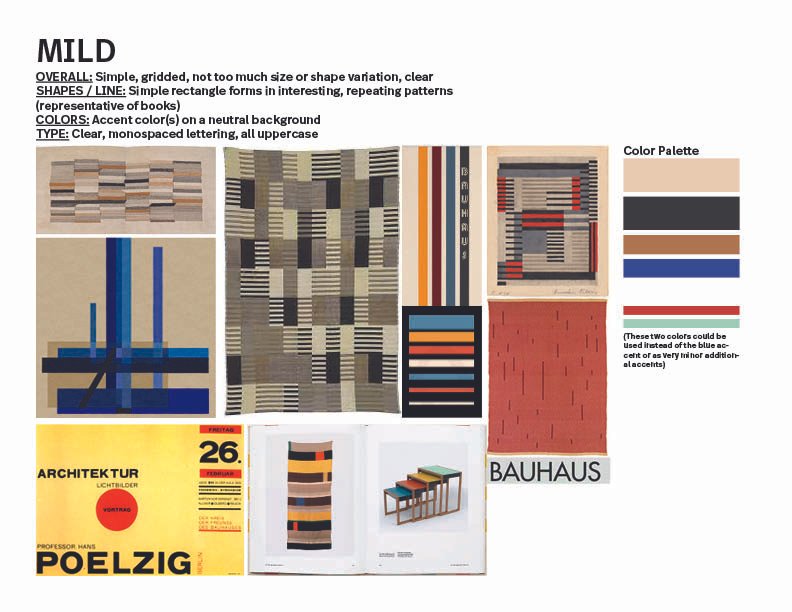
Jessica Hurst, the owner, asked me to create a “Sophisticated, quirky, modernist Bauhaus” storefront. The exterior was meant to be simple but obviously Bauhaus—a design that could be easily understood in a quick glance from the street. She had planned for the interior to be more intricate in contrast.
Since there are a lot of iterations on this page, I recommend looking through with process in mind and to see how the project continued to unfold until it was put on hold.
While the sister bookstore won’t be realized into a live shop, I’ve still included this project in my portfolio because it exemplifies my iterative process and how I incorporate feedback.

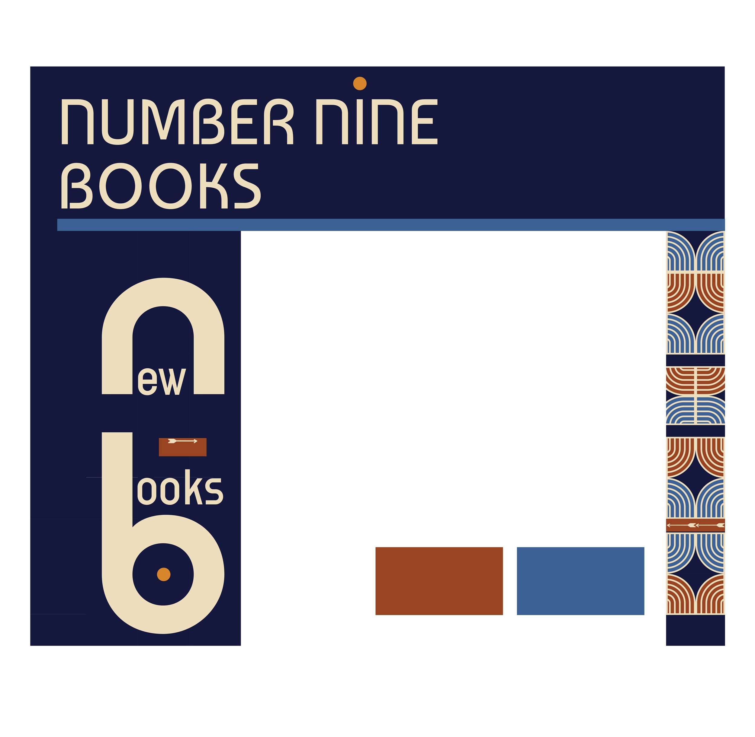
Salon Image was meant to be the new Number Nine Books

The new storefront, gridded out to scale
Mood Boards


Early Iterations
Early in the process, I worked on finding the right Bauhaus language that fit the bookstore’s brand. Jessica wanted tessellations and for the storefront to harmonize with Mercer Street Used Books, while still standing on its own.
I worked to make the design fit the building’s brick structure and considered how to incorporate book motifs within the style. Early sketches came from some play. In the end, Jessica preferred a very simple and paired down design for readability.


Simplifying the Design & Color Palette
With feedback, I simplified the main front panel and reduced the colors. How to utilize the column space and create relevant tessellations were still big questions at this time.


Warming Up the Palette
The previous palette was feeling “techie” to me and that felt antithetical to this cute, local bookstore, so we moved into a warmer palette. It was at this time that Jessica asked to pair down the design and take away extra lines and shapes. The warmth helped offset the simpler design and make the exterior more welcoming.
Experimenting with Tessellations & Fonts
At this stage, we also explored new fonts (only to decide that the first font we’d landed on was our favorite!). Jessica felt strongly about tessellations and while I wanted to relate the shapes to book motifs, she didn’t feel it was necessary—they were Bauhaus and that was on-brand enough. So, instead, I worked to make the tessellations flow better with the actual sizing and spacing of the bricks.


Further Exploring Simplification
Receiving the feedback to simplify, I wanted to play around with other simpler ideas that were modeled after Bauhaus buildings. Jessica still preferred the previous versions. A friend of hers was working on a character for the shop, a bee (much like how Mercer Street Used Books has a whimsical bird), so these sketches include a placeholder bee.


Harmonizing Colors with Mercer Street Books
While keeping with the primary color theme, I got curious to see if we could bring in Mercer Street Books’ colors to visually tie the two stores together. Jessica preferred the previous palette and decided the stores didn’t have to explicitly sisters.
Playing with Scale
I realized that the “New Books” lettering would be massive and potentially less readable at the current scale, and offered a new version at a smaller scale. Jessica still preferred the larger version. This is where the project paused—we never quite settled on a finished version.


Images In-Situ
A timeline of the progress in-situation. Some of these were top contestants and some of these were helpful to see mocked-up in order to make decisions and keep the project moving.


